Saturday 23 October 2010

A Dasher Good Christmas

One of the worst things for me at Xmas is deciding what cards to make. So much stash, so many ideas and soooooo many peeps to make cards for. Do I bore myself rigid and make over 100 all the same or do I go through the agonising process for each and every one?

I'll admit to being a bit of a butterfly and hate doing loads of the same thing so I decided I'd chose one colour and predominently one stamp then do half a dozen of each design I come up with.

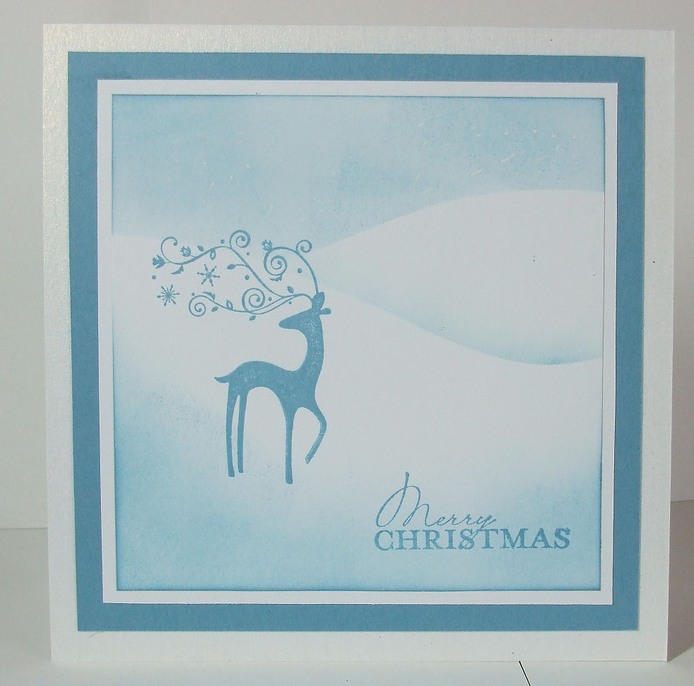
The colour I chose was blue and the stamp Dasher.

Now I can't decide between marina mist and baja blue so I'll do a mix of each lol


This is using the 3kings template from scs.

Baja blue & whisper white cs, baja blue ink sponged to make a scene which runs around all 3 sides.

Serene Snowflakes randomly stamped to create the frill. White satin ribbon sponged with baja breeze to give just a hint of colour. Base frill punched with scallop trim border punch and a few gems. Sentiment is from Contempo Christmas.


Same card & ink but this time I've used a sentiment from Curly Cute, big square word block from Season of Joy and a flourish from a retired set. All of the panels have been sponged around the edge using the daubers. Pic doesnt really show it but Dasher has lovely sparkly antlers after 1 zig 2 way glued along the stamped line and covered with dazzling diamonds.


Switching to Marina mist cardstock & ink now.


This has to be one of the easiest cards I've ever made, whisper white sponged with marina mist to create a landscape and a sentiment from Contempo Christmas. It probably doesnt show but I've dotted the sky with my white inkessentials pen.


Same ink, same card, same stamps and the same technique but this time I used the waste from a nestie to create a mask.

Tiny bow from silver elastic cord and a wee brad.


Chosing just one colour and one stamp has proven very economical.

Dasher, 116816 £7.95
Pack of 40 whisper white a4 cs 106549 £7.50
Pack of 20 baja breeze a4 cs 106565 £6.25 (marina mist 121682)
Baja Breeze ink pad, 111833 £4.95 (marina mist 119668)
Postage £4.95

Total £31.60

If you'd like to order any of the StampinUp range please just drop me a line at playingwithpaper@googlemail.com

nb, SU don't make card blanks in the size I wanted so I used various white card blanks I've had here for a long time.

Friday 15 October 2010

More Just Believe

It was mums birthday yesterday and her favourite flowers are daffodils. I've done her plenty of daff cards over the years this time I decided to use the colours found in daffs as the theme rather than the actual flower.

3 of the new In Colors fitted the bill perfectly, peach parfait, poppy parade and pear pizzazz and of course I couldnt not use daffodil delight. I teamed it with a sketch from Truly Scrumptious

In real life the daffodil delight is quite a soft colour for a yellow. I loathe yellow cardstock as a rule but this isnt too bad, will never be my favourite card colour but it doesnt offend me lol.

In colour markers used direct to the Just Believe flower. Peach parfait for the so swirly wheel. Boho Blossom punch teamed with Punch Potpourri and some old olive taffeta ribbon. Scallop trim corner punch used in the top right corner, bit of a liberty with the sketch I know but it looked better for me this way.


A couple more from Just Believe before I had to force myself to put it down and get cracking with Xmas cards.

After the card I made a couple of days ago I decided to use Lap of Luxury DSP again.


Very vanilla, & pretty in pink cardstock, concord crush and basic grey ink. Pretty in Pink taffeta ribbon and the scallop trim border and corner punch with just a few gems to finish.

Now I'm hoping that the 2nd card is round the right way, it's saved properly on the pc but blogger seems to want to rotate it, odd. Edited to add, no it hasnt. Very very odd as I've tried with several different jpgs of the card. Even a new photo lol.


This is cased from a card by Lee Conroy, her's is one of the most perfect xmas cards I've seen for a long time. I havent changed much at all.

En Francais & tree trimmings stamped with versamark and embossed with SU gold ep. Whisper white, real red & gold mirri cardstock. Base card is one I cut & scored a long time ago, I rarely if ever make a6 cards any more but it was perfect for this one. Real red satin ribbon to finish. Wish you could see the ribbon in real life as it's so rich in colour & sheen it looks incredibly expensive. Perhaps some of the relations wont think handmade cards are the *cheap* option this year.. if only they knew lol ;o)

Tuesday 12 October 2010

Papertake Weekly Challenge


This weeks Papertake Weekly Challenge was to chose any previous challenge, I used last weeks sketch. Loved the sketch but more truthfully was itching to get inky lol.

This is from Just Believe stamp set and has been daubed with basic grey, concord crush & pretty in pink before being stamped onto very vanilla.

Papers from Lap of Luxury DSP. Concord crush & pretty in pink cardstock with pretty in pink taffeta ribbon. Just Believe sentiment punched with word window punch. imho a really boring punch design but in practise sooo handy lol.

Monday 11 October 2010

Undecided title lol

I couldnt decide on the title for todays post.. it was a split decision between I'm a Donut and Possibly the Best Stamp Set Ever. I'll let you decide which it should have been lol.

Donut, because I've done something so stupid I really can't believe it.... I've been hankering after the bauble punch from SU since I saw it in the US catty last year. September 1st arrives and we get a sneak peak at the new catty and woohoo we've got the punch... fast forward 4 weeks and I can finally order it.. I've got my need list all tidily arranged on a spread sheet so I don't forget anything. Woohoo the very nice man from UPS arrived early this morning with a ginormous box. I was very restrained... and rammed my tea & toast down my throat, washed the raspberry jam from my fingers before hacking at the box to get in it as quick as humanly poss. Squeals of delight as I grab my new goodies then it dawned on me.. delightful decoration stamp set yes, xmas wheel yes, jolly holiday papers yes, old olive ribbon yes, where's the bauble punch..Yep I forgot to copy & paste the code number for the punch. Gutted isnt the word to describe how I felt for all of the 10 minutes it took to log in and order it (and a few other things lol).


Possibly the Best Stamp Set Ever?

This is what really lifted the disappointment.. Just Believe. I'll be honest when I first saw the catty I was so busy looking at other things this one was overlooked until I happened to be looking in the SCS galleries.. WOW. I needed this set and I needed it straight away. Not often I use the same set 5 times in a single afternoon but I couldnt help myself. I can see me playing with it some more tomorrow.


This is the first card I made and was inspired by the Saturday Challenge Blogs theme for the week, distressing. Sorry about the photo, it doesnt sag in the middle.. I took the photo at a dodgy angle and used the perspective tool in PSP to right it.. not a good idea lol

Soft suede, crumb cake, & very vanilla cardstock, early espresso, crumb cake and soft suede ink.

En Francais script background, perfect punches sentiment, Just Believe.

Very vanilla taffeta ribbon and 3 new punches, scallop trim border, scallop trim corner and curly label extra large.


I fell in love with soft suede & crumb cake a long time ago when they were US colours. Teamed here again with early espresso & very vanilla again.

The central image is from the same set and was decoupaged. The larger background image was using a 2nd impression with crumb cake.


Again the same 3 colours but I used some of the champagne glitter paint and dauber to sponge some glitz over the vase.

Not sure about the layout (sketch from stamping411). It was going to be recycled into a different card but hubby loved it so it had a reprieve lol.

Vase made with the new oval extra large punch.


This is a stamp that cries out for multicolour stamping. Markers are something that I've tended to overlook a lot lately thanks to copics but that's about to change, well when I've saved enough pennies for the SU markers in the new colours.

Just because there's been a colour renovation I still like and will use the older colours. This is using 3 of the retired greens and real red markers. Coloured on to the stamp, huffed on then stamped on to very vanilla. If you look at the leaves carefully you'll see where the shades have merged together. Lovely technique and only possible with dye based pens. Sentiment from the same set, Just Believe but the top layer was punched with the curly label extra large. The bottom layer was cut by hand very carefully lol. Old Olive cardstock.


Odd colour combo time, old olive, melon mambo and elegant eggplant. Everything screams at me that it shouldnt work but somehow I think it does, or have I just got dodgy taste lol. I do think it might have been better if I'd used old olive as a border and the melon mambo as the base, maybe next time.

Not a card, this is a rather large corner bookmark. The old olive base was stamper with versamark. The main image was using daubers to dab the three inks in place. It's a similar technique to using the pens but if you look at how the eggplant & melon have merged it's a much softer look. I'm so chuffed with how they look in real life I'll be daubing a lot more eggplant & melon. Scallop trim edge & border punches also used.

Friday 8 October 2010

CAS bauble


I love clean & simple and I'm really pleased with how this one came out.

Whisper white masked with the waste from a nestie ornament and strips of torn paper. Baja Breeze sponged over for a background. I did try with some cutndry to speed things up but wont show you the dogs dinner it made. Daubers are best for this as you need to control the ink.

Lovely as a tree stamped with Pacific Point before being overstamped with versamark heat embossed with heat & stick powder then dusted liberally with dazzling diamonds. Sentiment from Contempo Christmas and stamped in pacific point. All matted on to baja breeze cs.

Thursday 7 October 2010

Mixed bag

Bit of a mixed bag from me today, you've got no idea how good it is being able to play with inks again!


This one is simulating a crimper technique on SCS. I used a hougie board instead of a crimper.. next order that goes in is going to have the new A4 crimper!! All that lining up and scoring was a bit like hard work :o(

Contempo Christmas was used for the tree and sentiment (my idea of a perfect sentiment stamp, love the design)

Whisper white, garden green and real red cs/inks with just a pinch of dazzling diamonds on the star. Pic doesnt show it but it really sparkles in real life. For me real red is the ultimate in true xmassy reds and I normally use loads of it at this time of year.


Christmas colours again but this time I've used old olive, cherry cobbler and very vanilla. Cherry cobbler is a blood red in real life and has a very rich tone to it. Perfect with many of the SU greens and vanilla.

I used a couple of the stamps from Artistic Etchings and the box was cut with scal & my cricut. Very easy to make if you have a circle template. There is a step by step at scs which uses an envie template.


This has been on my to finish list for a wee while. It's a bingo board that I started at Yeovil playday with some of my crafting buddies.

There is a pic of me somewhere in the dc gallery spraying the board with gold paint, trouble was I had my hand in the cast, was spraying outside Sandras kitchen shop and it was blowing a gale lol.

One of my all time favourite stamp sets, pocket silhouettes. Rich razzleberry, soft suede, pumpkin pie card & inks. Boho blossom, scallop border (pencil holder) and bird punch. Rich razzleberry grosgrain ribbon.

A few cheap gems, ikea pencil that happened to be in my pocket and a small post it note pad.

Wednesday 6 October 2010

Middlestep variation


This is a variation on the sidestep/middlestep card.

I cheated and made a template for scal & my cricut lol.

Both cards are using one of the new stamp sets, Contempo Christmas as the main focal point. The tree card is a tiny 3" sqr, the bauble 5"sqr.


I've also used Joy of Season Flourish, String from Tree Trimmings, Old olive, cherry cobbler ink & cs. Very vanilla cs, baroque border & sparking wheels, versamark, gold ep, very vanilla taffeta ribbon, dazzling diamonds glitter

There is a complimentary bauble punch which fits the stamp but we werent allowed to preorder it :o( Hopefully it's winging it's way to me now ;o)

Saturday 2 October 2010

I'm back

Sorry I've been so deadly silent lately. An accident on a quad bike left me with a broken scaphoid bone in my right hand... Yes, I'm right handed, very much so.. whisking an egg was hilarious and brushing my teeth left handed was, odd! More than 8 weeks with my hand in a cast was miserable and not only was typing a major problem but stamping was a big nono. I did try left handed but I wasnt very good.

Anyways my cast is now off and just in time for the new catty I can stamp again, yay.

My big problem now is that I have more than a few new ink pads & card add that to a few of the new clear mounted sets (woohoo, yes most of the SU sets now come unmounted and ready to use with acrylic blocks) and I have a dilemna what do I play with first lol.


This is one I managed to stamp left handed. Thankfully the distressed look didnt need to be stamped as well as I normally like.

This one is a mix of the old & new.

Bella toile background stamped with versamark & clear ep on to whisper white before being tinted with baja breeze (this ink is better than lush) and pear pizazz (one of the 5 new in colours).

En francais script background stamped with kraft, sorry the new name is crumb cake, then the eiffel tower and round pattern from Artistic Etchings was stamped with early espresso & baja breeze.

White taffeta ribbon tinted with pear pizazz ink. The sentiment is from one of the new sets, perfect punches and fits beautifully with the scalloped oval punch. Sadly we werent allowed to order the new large oval punch until yesterday but now I have and once it's arrived I inted to back the sentiment with some more soft suede cardstock to match the card base.

Thursday 15 July 2010

Card set & box

Earlier in the week I had some of my internet friends here for another playday. The project was a boxed set of cards. Having just taken delivery of some of the new yummy colours I just had to have a play.


I need to thank Jenny Moors from Stamping Moments for the inspiration as I fell in love with the set she made. The 2nd card in is using the same card but it's catching the light oddly.


The snowflakes are from the Serene Snowflakes set in this years mini catty. I do hope they appear in the main catty when it's released in Oct as these are my idea of the perfect snowflake stamps.


All of the cards are using nowt but soft suede (woohoo, I've been after this colour since it was launched in the US last year) with a pearlescent cream card stock that I've had for yonks, soft suede ink (2nd impression for backgrounds) and either kraft or very vanilla taffeta ribbon. I've also used the scallop border punch and made dipdots with the champagne shimmer paint. The light isnt catching them very well as in real life they're a lovely soft gold colour but the sparkle is amazing. I wish this had been out when I was deeply into parchment craft as it knocks spots off of the very expensive dipping ink I used to buy.
.


This one isnt making it into the box set as it doesnt quite match with the others but I had fun making the dip dots using the mat pack as a placement guide. This time I used white craft ink and 3d'd the centre.


This is the box I started on Monday using rich razzleberry (the other colour I've been desperate for) with bashful blue. Not so sure that the colours work or it could be that I need to stamp the snowflake again but this time have less of the blue showing.

Wednesday 3 March 2010

Hubbys birthday card


This whopper (8" square) is for hubbys birthday tomorrow using a layout from Sketch & Stash blog. I really must invest in a light box so I can take photos on an evening as the colours look a bit wishy washy here when they're quite butch in real life.

I've used my brayer with bashful blue, brocade blue, night of navy & pretty in pink to brayer the sky and water and garden green for the hills.

Lovely as a tree was reverse stamped into the water with the brayer and the stampamajig used to position the main tree. Sponged with various greens & choc chip watercoloured over the trunk. Sentiment from Circle of Friendship & punched with 2 of the SU circle punches.

Mounted on to night of navy and papers from Nouveau Chiq & Tea & Crumpets. I used my new martha stewart punch around the page set to add a decorative border.

Finally brocade blue grosgrain ribbon with a few gems.

Thursday 25 February 2010

Sketch & Stash challenge


This is using a stamp from Autumn Days set. In truth I wasn't too keen on it and only really bought the set for a couple of the foliage stamps. But after seeing the stamp used with reinkers to create a custom ink pad I had to grab it from my neglected pile and have a play.

Reinkers used, so saffron, handsome hunter, elegant eggplant and taken with teal. Cut with nesties label 4 which was sponged with some creamy caramel ink. The elegant eggplant card has been stamped with versamark and gold ep using my favourite background, En francais. Mounted on handsome hunter cardstock with choc chip ribbon and a feather from an old (an unused) duster. Once I'd decided on colour & cardstock everything just fell into place for the sketch & stash challenge blog.

Sunday 21 February 2010

Lovely As A Tree

I've had this set a lil while but hadn't got round to inking it.

A few minutes in the gallery at SCS and I was in 7th heaven. All photos were taken in artificial light so havent photoed as well as I'd have liked.

This one is using the scalloped circle punch to create clouds. Bordering Blue & Night of Navy ink. Dazzling diamonds along the edge of some white pearl cardstock.


This one just goes to show how different cardstocks effect ink. I stamped baroque motifs with versamark, heat embossed with clear then brayered taken with teal over some white gloss from Clarity Stamps. Instead of that wonderful teal colour it's gone more of a light navy blue. The base is sponged around the edges with taken with teal but this time on whisper white. What a difference it's made.


The colours have came out dreadfully in the artificial light so I may have to redo the pic.

Brayered pale plum with elegant eggplant and a light sponge with bashful blue.

Trees stamped in basic grey. Sentiment from Season Of Joy.


This is my version of a card made by Rox71 on SCS. She used a variety of tree stamps. This one is just using the one xmas tree.

Sponged with summer sun, pumkin pie, bashful blue and night of navy.

Forground trees stamped in handsome hunter with choc chip applied with a water colour brush along the trunks. If anyone is thinking that I've left too much snow come back and see the card when it's totally finished in Apr ;o)

Friday 19 February 2010

Wedding invite samples


Hubby has kindly offered my services to his niece for her upcoming wedding. All she knows is that she wants red & white with a top fold.

These are 4 I knocked up in a few minutes using Mr & Mrs set & coordinating wheel with real red and basic grey ink.

Seeing as these are just ideas these will be binned within a few weeks so I've only used cheap card & ribbon. I havent been none to precise with the stamping either.

A few more

While at Michelles blog I fancied having a go at these 2.

The first is 5 different red, orange & yellow SU inks sponged over some whisper white before being stamped with baroque motifs in chocolate chip. Michelle uses a fabby heart stamp for the central motif but sadly it's not available in the UK.. (yet)

The 2nd uses the oval punch to create 2 vases with wheat ears from Autumn Days and a leafy stamp from Pocket Silhouettes. Instead of stamping onto whisper white I've stamped onto some bashful blue dsp before sponging the edges with choc chip and distressing them. Sadly the pattern of the paper is playing havoc with the auto focus on my camera and it looks a lot better in real life.


While in a red and apricot mood I got the brayer out and had some fun with real red, ruby red and apricot appeal. The wheat ears were masked before brayering then I triple embossed the entire image, left it to cool then cracked the embossing. Choc chip ink was rubbed into the cracks before being buffed away. Kraft satin ribbon bow is holding one of my teeny bulldog clips which in turn is holding an oval all sentiment stamped on to acetate and punched with the oval punch. Mounted onto choc chip & kraft. I'm not too sure about this one though.

Tuesday 16 February 2010

Brayering gone wrong


I love Michelle Zindorfs blog, for those who don't know her she's a US Stampin'Up! demo and is amazingly talented with a brayer. While admiring her blog for the gazillionth time I decided to get the brayer out and have a play. 1, because I love my brayer and 2, we're having a brayer play day in Yeovil next month and I don't want to embaress myself ;o)

I loved a card she'd made a tut for but not having the bare tree stamp available in the UK I decided to use a frondy type stamp from Autumn Days to mimic a couple of rushes. Everything started out ok but as with my normal skim read of instructions I didnt quite get the inks in the right places then when I went back in to sponge some detail I had the worst accident possible... the moon mask ripped the top layer of whisper white. Typical, right in the middle of the moon where it stuck out like a sore thumb. Here's were I should have started all over again but no, not me. I struck on the bright idea of sticking the paper back and stamping a silhouette of a bird over the top. I've got 100s of stamps and the only one half suitable was from a donkeys years old and dirt cheap grab bag. I'd never even inked it before, and once I'd stamped I realised why it was dirt cheap and had never seen ink. It's not as bad as it could be but I think this one is one of those cards that I ought to learn by but wont ;o)

Taken with teal & apricot appeal cardstock and ink with bashful blue & pumpkin pie ink. White inkssentials pen across the water.

Thursday 21 January 2010

Yeovil girlies look away now.

There are a load of us docraft members meeting up for a playday in Yeovil in a few weeks and we're making 3 projects using the following 2 stamp sets. Soooo if you're coming to Yeovil look away now ;o)

One of the great things working with SU papers is that I can work at night and know that the colours will always match. Not like a few xmas's ago when I sat and cut 50 bookatrix cards while watching a film. I was horrified the next morning when I realised the white hammer cardstock wasnt all the same shade! It should have been as it had all been bought from papermill but it wasnt and it was glaringly obvious.

This is playful petals co-ordinating with it's DSP paper set Tea Party. Stamped onto whisper white before being coloured with markers and 3d'd.

My favourite SAB set, whimsical words sentiment stamped on so saffron before being attached to the main image with some rings.


This was supposed to be the project for Yeovil but our loud mouthed spidy had to say "but what about making it into an easel card"!


Well this one is Kraft & bella bleu dsp with playful petals stamped on whisper white & ballet blue before 3d'ing.

I opened my precious pot of filigree brads to make the drawer handle.


Here is the project we are making albeit we're using different colours.

This is an unusual combo of colours, taken with teal, very vanilla and mellow moss cs and Nouveau Chic dsp. Again playful petals has been 3d'd and I used oval all sentiments with the plain and scalloped punch.

Another of my precious filligree brads for the handle.


Top tip for anyone making these small treat boxes... decorate before you make the box.. makes life easier and you can use the stamp a ma jig to centre things, oops lol.

Almost amethyst & perfect plum card with perfect plum, bashful blue, lavender lace inks. Sentiment is from Vintage labels, flowers from playful petals, flight of the butterfly stamps and matching punch. Scalloped circle and 1 3/8ths circle punch.

Wow, huge recipe list for a box that only measures 2" lol


I love playing with backgrounds, this one was made by dapping on several colours of inks before spritzing with water and more dapping whilst still damp then triple embossed with clear ep and a dazzle versamark ink pad.

Craft white ink stamped onto vellum before being punched and a very fine edging of dazzling diamonds. Matted onto elegant eggplant over whisper white which had been ran through a cuttlebug folder. Scallop punched border and some elegant eggplant grosgrain ribbon.


This is the top secret project for Yeovil, a zig zag card using pocket silhouettes & flight of the butterfly.

Certain Celery, almost amethyst and whisper white cs with lavender lace, pretty in pink, certain celery ink. This is much easier to make than a trifold shutter but you have to be precise with the measurements.

Playing with background stamps

It's been good to get back to playing with rubber & ink now that the havoc xmas & snow creates is well and truly gone. This week I've been playing with background stamps and a couple of new stamp sets. There's a fair few so I'll split it into a couple of posts.

These are all made with background stamps.


A very very quick basic card using Medallion, stamped in chocolate chip on kraft cs and matted on very vanilla & chocolate chip. I used the eyelet border and word window punch to add some detail.


Another medallion but this one was a bit an experiment that had an accident.. I'd forgot to clean the stamp and had coloured the outer ring with a couple of water colour wonder crayons before misting with cleaner (couldnt find my water spray and I was only really looking to see how the crayons liked the stamp).

Once stamped onto whisper white the brown ink came through and muddied the colours in a way I wouldnt have expected but I kind of liked the look.

Matted on perfect plum then over whisper white with baroque motifs stamped in pale plum and scallop border punch over pale plum cs.


I don't do distressed as a rule but french script just lends itself so well I find I can't help myself.

French script stamped in creamy caramel over very vanilla the the ink pad was dragged over the edges and sanded down. Baroque motifs stamped in chocolate chip over the corners. Oval all sentiment with the scalloped and plain oval punch with some wide gros grain chocolate chip ribbon and a few gems.


I wasnt that struck when I saw Bella Toile in the catalogue and it was relagated to my would like but not desperate group. D'uh, that was daft! Now I've got it I'm in love with it, beautiful pattern and it stamps like a dream.


This is elegant eggplant stamped on very vanilla matted on elegant eggplant. The sentiment is from one of the exclusive SAB sets, vintage labels and is matted over very vanilla ribbon. The eyelet border punch finishes off the edges.


This one uses pale plum ink & perfect plum, pale plum & whisper white cardstock. The flower is from Garden Dream (a hostess set) and has been watercoloured with ink from the pale plum pad.

Eyelet border again and white grosgrain ribbon.


This is why you should never photo a card in artificial light. Bella Toile has been stamped in chocolate chip on pretty in pink cs and in real life is very pale.

Oval all sentiment and oval & scallop punch with pretty in pink taffeta ribbon.


This was my first play with whisper white craft ink and as a parcher the hunt has always been on for a decent white ink pad which will dry on vellum and OMG I've finally found one.

Bella Toile was stamped in whisper white on some black vellum I've had lying around for years. It's not a perfect typex white, that's technically impossible for a thin enough ink to stamp with, but this is not far different to using pergamanos tinta white with a dipping pen.

I used whisper white ink with a flight of the butterfly stamp on to parchment paper before using a grid and embossing & perforating. The butterflies where then punched using the new butterfly punch.

All matted on to whisper white and basic black card stock with whisper white taffeta ribbon.